- Joined
- Aug 18, 2008
- Messages
- 4,081
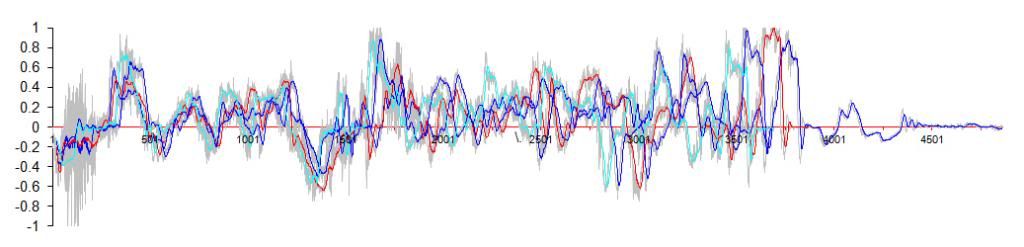
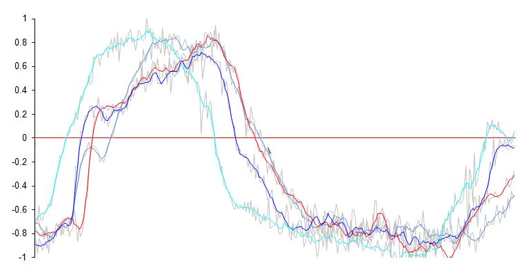
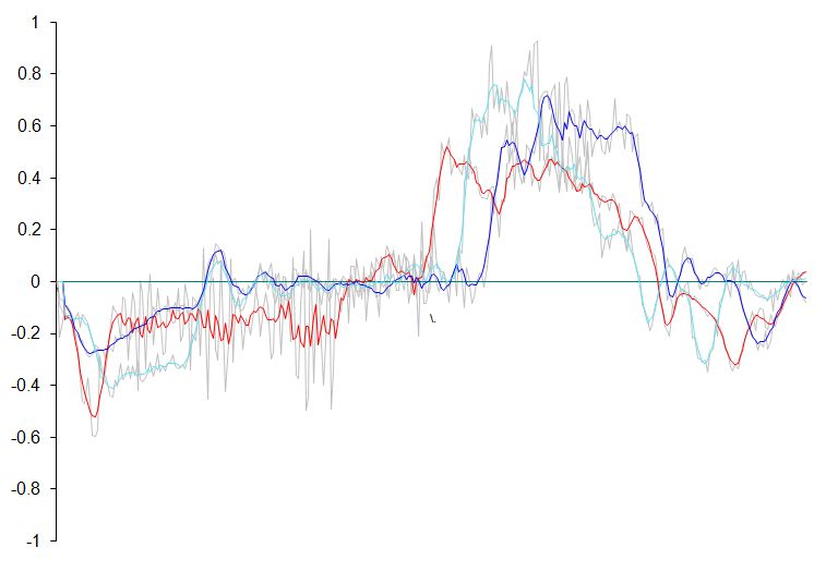
So I was pissing around on excel whilst reading through my new geek bible I remembered I took some pikey style data logs at my last trackday at Brands Hatch. Turns out you can use the basic Ax/Ay accelerometer logs to plot out a G-G diagram, which effectively depicts the friction cirlce of your car. This is a useful tool for highlighting the limits of the vehicle and how close you are getting to those as a driver.
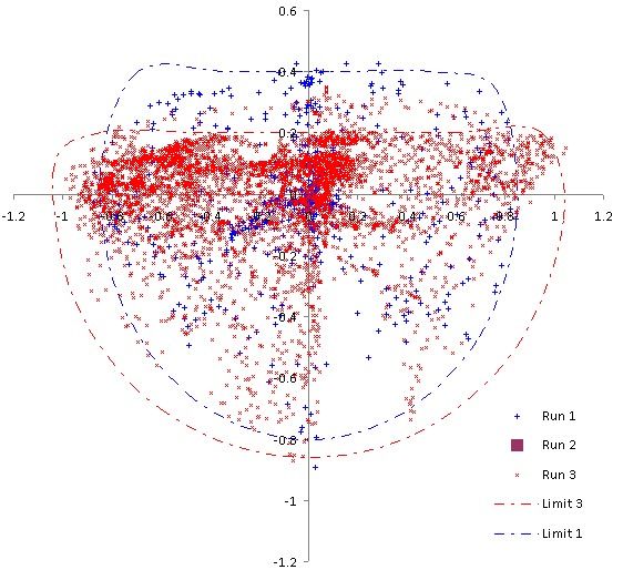
Here's a plot from one of my sessions:
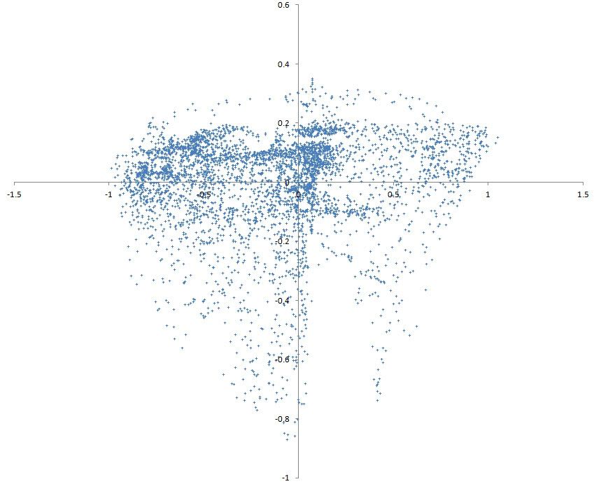
I can see I'm at the limit at about 1G lateral, 0.8G braking and power limited to around 0.3G acceleration. That big gap in the lower left quadrant is either me consitently cocking up a corner (Graham Hill most likely) or simply the fact that there aren't many left hand bends at Brands.
This was really simple to generate, I used the Rev Lite app for my iPhone (free on iTunes) and placed the phone down in the coin tray under the handbrake, held down with a few tabs of blu-tac. After the session the data plots are exported as .csv files to my email address, I can then open them up on my laptop in Excel and simply plot a scatter diagram of both the longitudinal and lateral accelerations.
Since it's so easy to do, I thought a few of you keen trackdayers might be interested in having a go and comparing some plots?
I will be using this as a driver and vehicle development tool next season. I want to see a higher density of plots around the outer edge of that mess (more consistent limit driving) and to extend those boundaries with better use of the contact patches (better suspension and brake setup).
[/geek]
Here's a plot from one of my sessions:
I can see I'm at the limit at about 1G lateral, 0.8G braking and power limited to around 0.3G acceleration. That big gap in the lower left quadrant is either me consitently cocking up a corner (Graham Hill most likely) or simply the fact that there aren't many left hand bends at Brands.
This was really simple to generate, I used the Rev Lite app for my iPhone (free on iTunes) and placed the phone down in the coin tray under the handbrake, held down with a few tabs of blu-tac. After the session the data plots are exported as .csv files to my email address, I can then open them up on my laptop in Excel and simply plot a scatter diagram of both the longitudinal and lateral accelerations.
Since it's so easy to do, I thought a few of you keen trackdayers might be interested in having a go and comparing some plots?
I will be using this as a driver and vehicle development tool next season. I want to see a higher density of plots around the outer edge of that mess (more consistent limit driving) and to extend those boundaries with better use of the contact patches (better suspension and brake setup).
[/geek]